


Over the past few weeks, I’ve been working on organizing and cataloging all the various pieces of literature we’ve produced over the past 28 years. It’s been fun to see where the company has come from, and, as a graphic designer, to trace the history of our logo over that time.
The “logo” above appeared on our first catalog in 1983. That’s the only time it ever appeared.
This logo first appeared on the cover of our 1989 catalog. It was our first official logo and versions of it were used for eight years.
Here you can also see the origins of the “QC” in our name. It comes from “Quick Conversion” which allowed our customers in the metal stamping industry to change out their dies and conveyors quickly.
This logo is the first direct predecessor of our current logo, appearing on the cover of our 1997 catalog. When this logo is reduced our name becomes nearly unreadable, but versions of it somehow persisted for seven years.
One oddity of the 1997 catalog: while the logo above appeared on the cover, the logo at right appeared on the back. To my knowledge, this is the only time the left side of the “Q” ever showed. It almost seems to have been an accident.
The logo evolved slightly for the 2001 catalog. This logo continued with numerous changes (in some versions the word “modular” is replaced with “low profile”).
This logo first appeared on the cover of our 2004 catalog and has been used without modification to this day.
I hope you’ve enjoyed this quick peek back at our history!
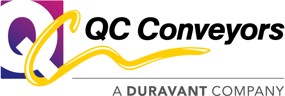
UPDATE (7/1/18): Our logo has gone through another revision as we’ve changed our name to QC Conveyors and we’ve become a part of the Duravant family!