


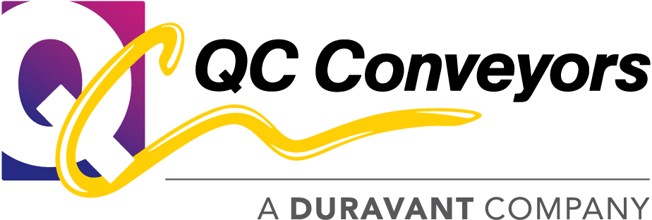

We recently launched a new version of the QC Industries logo. It keeps the well-established brand identity of the old logo, but brings it in line with 2017 standards, using more vibrant colors and more refined shapes.
Among other things, the changes include:
- Refined highlights
- Modified colors
- More proportional box
- Refined C shape
- New typeface
We’re excited to roll out these changes over the next few months as we update various pieces of our identity. What do you think of the new look?